

Table of contents


No headings in the article.
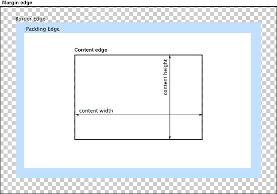
The CSS box model is a container that houses the content as well as other attributes like padding, margins, and borders. It is employed to produce the style and arrangement of web pages. It serves as a toolset for modifying how various pieces are laid out. According to the CSS box model, the web browser presents each element as a rectangular box.
Every box is composed of four parts (or areas), defined by their respective edges: the content edge, padding edge, border edge, and margin edge.
Content area:
The content area, bounded by the content edge, contains the "real" content of the element, such as text, an image, or a video player. Its dimensions are the content width (or content-box width) and the content height (or content-box height). It often has a background color or background image.
If the box-sizing property is set to content-box (default) and if the element is a block element, the content area's size can be explicitly defined with the width, min-width, max-width, height, min-height, and max-height properties.
Padding:
Padding is space added between the content and the border of its own box. You can declare it using the padding property, and giving it a length.
Here's an example:
<!DOCTYPE html>
<html>
    <head>
        <title>Padding</title>
        <style>
            div {
                background-color: lightblue;
            }
            .no-padding {
                padding: 0;
            }
            .some-padding {
                padding: 2rem;
            }
        </style>
    </head>
    <body>
        <div class="no-padding">I have no padding</div>
        <br>
        <div class="some-padding">I have some padding</div>
    </body>
</html>
Output:
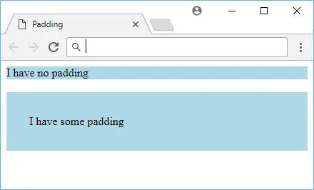
As the image shows, the element that got some padding appears larger than the element that got zero padding. The blue background helps to illustrate where the element's borders are.
You can also set padding on each side individually, by using padding-top, padding-right, padding-bottom, or padding-left.
Border:
At the edge of the content plus the padding you defined is the start of the element's border. By default, an element will not have a border, but you can define one with the border property.
The syntax for it is the width or thickness of the border, the style, and then the color.
For example, if you wanted a blue, dashed, 2 pixels thick border, it would look like this:
<!DOCTYPE html>
<html>
    <head>
        <title>Border</title>
        <style>
            .blue-border {
                border: 2px dashed blue;
                padding: 1rem;
            }
        </style>
    </head>
    <body>
        <div class="blue-border">Sweet border!</div>
    </body>
</html>
Output:
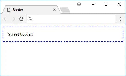
Here are other border styles you can use:
soliddotteddasheddoubleinsetoutsetgrooveridge
Borders can be applied to most elements.
Border Radius
One way you can customize borders is by setting a border-radius. You can round off the borders of your element using border-radius, like this:
<!DOCTYPE html>
<html>
    <head>
        <title>Border Radius</title>
        <style>
            .rounded-corners {
                border: 0.5rem solid purple;
                padding: 1rem;
                border-radius: 1rem;
            }
        </style>
    </head>
    <body>
        <div class="rounded-corners">Rounded corners!</div>
    </body>
</html>
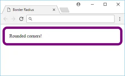
The value for this property is any length of your choosing. The default value is 0, which means that the border will not be rounded. You can also use 50% to round off the border fully.
Box Shadow:
You can add a shadow to an element by using the box-shadow property. The syntax is the same as for borders, but you can also use inset and outset to make the shadow appear inside or outside of the element.
For the most common uses of this property, it takes five values, the horizontal offset, the vertical offset, the blur radius, the size of the shadow and finally, the color. The color is optional, and if you don't specify it, the shadow will be black. Here's an example:
<!DOCTYPE html>
<html>
    <head>
        <title>Box Shadow</title>
        <style>
            .box-shadow {
                background-color: lightpink;
                border: 0.25rem solid red;
                padding: 1rem;
                margin: 2rem;
                box-shadow: 0.5rem 0.5rem 0.25rem darkgray;
            }
        </style>
    </head>
    <body>
        <div class="box-shadow">Box shadow!</div>
    </body>
</html>
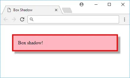
Box shadows can be applied to most elements.
Margin:
To add space around an element, you can use the margin property. It takes a length and can be applied to all four sides of the element. Unlike padding, which was spacing inside the element's border, margin is spacing outside the element's border, and you declare it using margin.
Here's an example:
<!DOCTYPE html>
<html>
    <head>
        <title>Margin</title>
        <style>
            span {
                background-color: green;
                padding: 0.5rem;
                border-radius: 0.25rem;
                display: inline-block;
            }
            .low-space {
                margin-left: 1rem;
            }
            .med-space {
                margin-left: 5rem;
            }
            .high-space {
                margin-left: 10rem;
            }
        </style>
    </head>
    <body>
        <span class="low-space">A</span>
        <span class="med-space">B</span>
        <span class="high-space">C</span>
    </body>
</html>
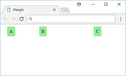
While a difficult concept to illustrate, it should be clear to see that the more margin on the left side of the element, the further away it goes, even though all the elements have the same amount of padding.
This is because, again, padding affects only inside the element's border while margin affects what is outside it.
In the CSS box model, the subject area of an entity box is the region where the content, such as image, text, video, etc., initially appeared. It may also retain boxes of decedent elements.