

Table of contents


No headings in the article.
In CSS, the flexbox layout model provides flexible and efficient layouts with distributed spaces among items to control the alignment structure of items. It is a layout model that makes arranging items within a container easy and clean. Small-scale layouts can be created with Flexbox, and it is responsive and mobile-friendly.CSS Flexible boxes also known as CSS Flexbox, is a new layout mode in CSS.
Features of flexbox:
A lot of flexibility is given.
Arrangement & alignment of items.
Proper spacing
Order & Sequencing of items.
Bootstrap 4 is built on top of the flex layout.
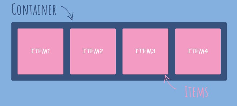
There are 2 main components of the Flexbox:
Flex Container
Flex Items
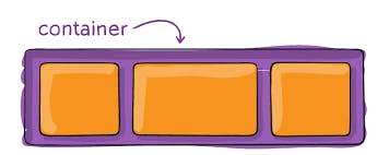
Flex Container
An area of a document laid out using a flexbox is called a flex container. To create a flex container, we set the value of the area's container's display property to flex or inline-flex. As with all properties in CSS, some initial values are defined, so when creating a flex container all of the contained flex items will behave in the following way.
Items display in a row (the
flex-directionproperty's default isrow).The items start from the start edge of the main axis.
The items do not stretch on the main dimension but can shrink.
The items will stretch to fill the size of the cross-axis.
The
flex-basisproperty is set toauto.The
flex-wrapproperty is set tonowrap.
Flex items
The flex items specify the properties of the children. There may be one or more flex items inside a flex container.
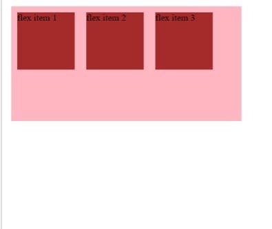
Take three flexible items inside a flexible container as an example. By default, they are positioned from left to right along the horizontal flex line as follows:
<!DOCTYPE html>
<html>
<head><meta http-equiv="Content-Type" content="text/html; charset=windows-1252">
<style>
.flex-container {
    display: -webkit-flex;
    display: flex;
    width: 400px;
    height: 200px;
    background-color: lightpink;
}
.flex-item {
    background-color: brown;
    width: 100px;
    height: 100px;
    margin: 10px;
}
</style>
</head>
<body>
<div class="flex-container">
  <div class="flex-item">flex item 1</div>
  <div class="flex-item">flex item 2</div>
  <div class="flex-item">flex item 3</div>
</div>
</body>
</html>
Output:
Flexbox Axes: While working with Flexbox, we deal with 2 axes:
Main Axis
Cross Axis
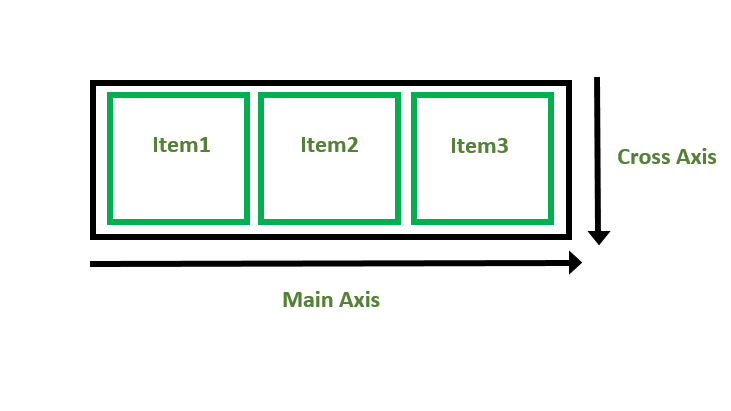
Main Axis:
By default, the main axis runs from left to right.
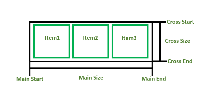
Main Start: The start of the main axis is called Main Start.
Main Size: The length between Main Start and Main End is called Main Size.
Main End: The endpoint is called Main End.
Main And Cross Axis
left to right:
flex-direction: row;
right to left:
flex-direction: row-reverse;
top to bottom:
flex-direction: column;
bottom to top:
flex-direction: column-reverse;
Cross Axis: The cross axis will be perpendicular to the main axis.
By default, Cross Axis runs perpendicular to the Main Axis i.e. from top to bottom.
Cross Start: The start of the Cross axis is called Cross Start.
Cross Size: The length between Cross Start and Cross End is called Cross Size.
Cross End: The endpoint is called Cross End.
CSS3 Flexbox Properties
Following is a list of CSS Flexbox properties:
| property | description |
| display | it is used to specify the type of box used for an HTML element. |
| flex-direction | it is used to specify the direction of the flexible items inside a flex container. |
| justify-content | it is used to align the flex items horizontally when the items do not use all available space on the main axis. |
| align-items | it is used to align the flex items vertically when the items do not use all available space on the cross-axis. |
| flex-wrap | it specifies whether the flex items should wrap or not if there is not enough room for them on one flex line. |
| align-content | it is used to modify the behaviour of the flex-wrap property. it is similar to align items, but instead of aligning flex items, it aligns flex lines. |
| flex-flow | it specifies a shorthand property for flex-direction and flex-wrap. |
| order | it specifies the order of a flexible item relative to the rest of the flex items inside the same container. |
| align-self | it is used on flex items. it overrides the container's align-items property. |
| flex | it specifies the length of a flex item, relative to the rest of the flex items inside the same container. |
Supported Browsers:
Google Chrome 29.0
Firefox 22.0
Microsoft Edge 11.0
Opera 48.0
Safari 10.0
Conclusion
CSS Flexbox helps the user in creating flexible and responsive layouts which are compatible with all the devices. it is used to arrange items horizontally as well as vertically. It is a CSS module that has its child properties. Flexbox property is used when working with small layouts, for example, the navigation bar.